Pages

Sunday, March 30, 2014

Developing a cross-platform game with Haxe, OpenFL, and HaxePunk

In a previous post, I announced the release of Gorilla Defense for Android, which was developed using the Haxe programming language. I've seen Haxe and OpenFL getting some social media attention lately, and people may be wondering what the process of developing a cross-platform game is really like and whether Haxe lives up to the hype. Here's a little technical writeup detailing my experience.

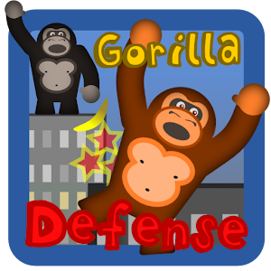
Gorilla Defense is a quick and fun tower defense game. It's available for Android (Google Play, Amazon) as well as Flash (Kongregate) and desktop (not yet released). I'd love to release iOS, BlackBerry, and Windows Phone versions but I don't currently have any of those devices - hopefully coming soon, though.

In short, I was able to develop the core game in three days, and have added roughly an additional week of development time for polish and integrating some Android SDKs. Part of the reason I'm able to work so fast is because I've been working with Haxe long enough to have a good grasp of the technical ecosystem. I know what it's capable of and what's going to be easy, I can use previous projects as samples, and use this knowledge to guide design decisions from the very beginning. The other part is the incredible tool itself - you'll see that deciding to make Gorilla Defense cross platform actually involved very little additional work on my part due to the maturity of Haxe, OpenFL, and HaxePunk.


Development


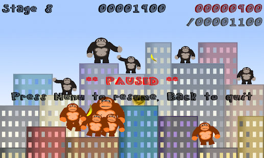
The idea came suddenly: I had been wanting to develop a quick tower defense game, and somehow found myself remembering the old "Gorillas" DOS game. The two ideas had a whirlwind romance in my head and their child Gorilla Defense was born.


Graphics


I planned Gorilla Defense as a cross-platform game from the start, so I knew I'd want device-independent graphics. I decided to use Inkscape to draw my gorilla character using SVG:


Each body part is an individual Inkscape layer (there's only one leg because the legs are identical.) I used a quick Python script and the Inkscape command line to tool to split out each layer into a PNG image at various resolutions, then used Spine to put together a skeleton and create some basic animations - walking, falling, climbing, just sitting there, and a victory dance. Since this is a workflow I've done several times before and the gorilla above is not exactly a huge feat of technical artistry, the process of creating the art took only a couple of hours. I also made a brown version for the enemy gorillas, and used a Spine skin to swap in all of the brown parts with a single switch.

The cityscape was developed as a tileset in Inkscape and individual city layouts were created using the Tiled map editor. I could've used procedural generation to generate random cityscapes like Gorillas did (actually that's something I'd like to add in a future update), but at this point I was going for development speed and wanted something that just worked without verifying that I was producing only valid skylines.


Putting the prototype together


HaxePunk is one of my favorite game engines. It's incredibly convenient for quick prototype development and is packed with features. It's also open source, but more than that, it's very well engineered. I started contributing to HaxePunk within weeks of starting to use it myself and am comfortable adding features, bug fixes, etc. whenever I need them.

In HaxePunk, you create a "Scene," add Entities for individual game objects, and use the Entity and Scene "update" methods called every frame to handle behavior. Entities have hitboxes and can take care of collision detection for you; I use simple rectangular hitboxes, but more complex varieties exist. During development, it's easy to compile for Flash or Neko (a virtual machine which is much faster to build for than compiling a native C++ application) and pull open a debug console.

The console lets you monitor the framerate, view debugging output, track entities and hitboxes, manually move things around with your mouse until everything looks just right, and more. You can pause, advance one frame at a time, or run at normal speed with the hitboxes shown which is very helpful for debugging any issues that arise.


My Spine animations were exported to JSON; I used spinehaxe (a Spine runtime for Haxe, written by me) and SpinePunk (a spinehaxe rendering engine for HaxePunk, also written by me) to get the gorillas moving. SpinePunk automatically generates hitboxes on a per-body-part basis, so I can define a combination of parts (head, body, legs) for the hitbox and it will track movement in those parts.

The prototype was straightforward to develop and took about 2 days of very part time effort.


Now for the cross-platform part


I did most of my testing on Flash, and at this point I had a functional Flash prototype. How did I go from that to an Android game? Are you ready?

I ran the command "openfl build android."

That's actually all there is to it. There are obviously some major differences between both platforms - rendering, for example. Flash uses a software renderer, which would be painfully slow on mobile devices. Fortunately, HaxePunk and OpenFL take care of these differences behind the scenes. I use standard HaxePunk Graphic objects like "Image," "Tilemap," "Spritemap," and "Emitter," and HaxePunk takes care of the differences in rendering for me. SpinePunk also has two rendering modes, one for software and one for hardware acceleration. This means that during the actual game development, I don't have to worry about these details one bit. I just have to create textures and make sure to use these standard cross-platform Graphic objects.

Fortunately, the game was developed with primarily mouse-based controls, which transfers to a touchscreen device very easily. With OpenFL/HaxePunk, the mouse controls actually translate across to mobile effortlessly - mouseDown is true when the player is touching the screen, mouseX and mouseY give the coordinates of the touch, etc.

When I run "openfl build flash," the Haxe code is cross-compiled into Flash bytecode, with all of the Flash-specific directives built in. When I run "openfl build android," it's cross-compiled to C++ and an APK is built using the Android NDK. Two one line commands produce two very different but visually identical, working versions of the same game with no additional effort on my part.

With one extra line in my project.xml file, I can even sign my APK, so that one line is all that's necessary to build a package that's ready for the app store of your choice.


Small differences


The Haxe language features conditional compilation, so you can include code blocks which are only compiled based on defined variables, such as which platform you're currently targeting, and this was necessary in a few places:
  • The control schemes were slightly different. On Android, I needed to overload the default back button functionality. I also defined menu and back as "pause" and "quit." On Flash these were defined as keys P and Q or Escape. HaxePunk allows giving names to one or more keys and using those names within your code, so the only part that requires a platform-specific block is the initial key definition.
  • Formats of sound files were different - Flash used MP3 for music, while Android used WAV. This affected a single variable (musicSuffix) defined in the Sound class. A Makefile was used to generate both versions of necessary sound assets automatically.
  • Text and assets in a few places needed to be changed - for example, "right click to buy a gorilla" on Flash is "tap and hold to buy a gorilla" on Android. For text, this was simple: #if mobile (some code) #else (some other code) #end. For images, OpenFL's asset manager is fantastic in dealing with these issues. In my project's XML configuration file, with two lines:

    <assets path="assets/help" rename="graphics" unless="mobile" ...
    <assets path="assets/help-mobile" rename="graphics" if="mobile" ...

    ...I was able to keep two separate directories of platform-specific help graphics. Both sets of images would have their paths renamed to "graphics" internally, so in the actual code, I didn't have to deal with the difference at all.
  • Recently I added a "thanks for playing, please review me!" screen that shows after a player has played three times. I created separate builds for Amazon and Google Play which I compile with one different command-line flag (compile with "-Damazon" for Amazon vs. "-Dgoogleplay" for Google Play) which will modify the review URL that is used. I added conditional code to only show this screen on mobile devices.
  • The Flash version uses the Kongregate API for leaderboards. Thanks to the author of kong.hx which is open source and available on GitHub, it took about 15 minutes to implement.


Including native SDKs


I incorporated two Android SDKs into the Android version, one for RevMob (ads) and one for Google Analytics. Both SDKs provide a .jar file and some documentation on how to alter your Android activity to incorporate their functionality.

In OpenFL, default template files are used for your Android activity, manifest, etc. However, it's easy to overload these with your own versions in the project.xml file. You can then add any necessary Java to incorporate the SDKs you need.

Calling native functions from Haxe is fairly simple. Having defined a "showAd" function in my MainActivity, I'd call it from Haxe using the name and JNI method signature:

    showAd = openfl.utils.JNI.createStaticMethod("com.monsterface.gordef.MainActivity", "showAd", "()V");
    showAd();


Conclusion


Haxe and OpenFL are an incredible technology stack that abstract away platform-specific differences and allow you to focus on developing quality games fast. Engines like HaxePunk and HaxeFlixel (and there are plenty of others, which I unfortunately haven't had the opportunity to try out yet) can take your productivity to the next level, providing debugging capabilities and common game and graphics functionality.

Support Haxe and OpenFL in this week's Humble Bundle weekly sale!

Update 4/4: the Flash version of Gorilla Defense has been published on Kongregate.

Saturday, February 22, 2014

Gorilla Defense is now free on Google Play and Amazon

Gorilla Defense is a banana-throwing tower defense game for Android. Throw bananas at invading gorillas to knock them off buildings and protect your banana stash. It's fast-paced, fun, and unforgiving.

Try it on Google Play! (It's free!)

Or Amazon! (Also free!)

If you enjoyed Gorilla Defense, please rate it and share it with your friends.


Saturday, January 11, 2014

New project in the works: Linear Quest

I've been working on a new project for about a month - code named "Linear Quest," it's a game where you control lovingly hand-drawn, animated stick figure characters in a 2D, sidescrolling, beat-em-up RPG. It features 7 playable classes and up to 3-player multiplayer (either on one device or over LAN.) I'm hoping to take advantage of the Ouya exclusive program which runs through this summer, so I'm trying to get a Kickstartable demo polished and ready by then. (Note that Ouya exclusives can still be released on Desktop, just not on any other mobile or console platforms for a few months after release.)

You can check out a rough combat demo on Flash now. Note that the Flash version can run a little sluggish compared to the version for desktop/Ouya, especially if you're on a laptop. WASD to move, L to attack, K to swap weapons, and hold Shift while moving to run.


One interesting design issue that I grappled with early on was how to "sell" hits - how to make it look and feel like there was a significant impact when you hit your opponent instead of just swinging your weapon around the enemy. The answer is that the impact of a blow is really the sum of a lot of little things that you might miss. Take a look at the demo and you'll see my solution so far:
  • The attacker and target freeze for a split second when the weapon connects - longer for big hits
  • The target flashes red briefly
  • There's a "hurt" animation - not too long, but long enough that you can set up combos
  • The target is knocked back slightly, or knocked to the ground for running attacks or the final hit of a combo
  • Progressive injuries are shown as HP is lost
  • Damage numbers start big and quickly shrink down to normal size; their size is proportional to damage, normalized by how much HP the enemy has
It's a problem that can always be tweaked a little more, so I'll probably keep going - by adding some subtle particle effects, for example.

Friday, November 15, 2013

Making games for people who care

I just read a great article from Jeff Vogel - "Principles of an Indie Game Bottom Feeder" (2012). It's fascinating to note that Vogel has made a living for along time selling games to a very specific niche audience who want to play them and pay for them. Some people are willing to pay a lot more for one of his games than they will for Angry Birds. And yet a common metric of success is total number of plays/downloads/sales, which is inherently biased toward casual, mass-appeal, cheap games. Angry Birds has made a hell of a lot more money than any turn-based indie RPG I'm aware of.

I recently got a review of GOTO WAR - I was happy with the review, and its scores were all high except "intuitiveness" which was pretty low. I was surprised at this because it's something I paid a fair amount of attention to. Players who gave me feedback during the GBJAM never failed to mention the control scheme as a positive thing. That's because they were expecting a Game Boy-style game, and, importantly, they read the instructions to figure out which buttons did what. To quote today's review: "players don't read instructions." You should be able to just click on anything on the screen and it should be immediately obvious how to play the game without ever bothering to read or think about it.

Now the review was very helpful, and the reviewer knows the audience (gamers on Flash portals) so they make a very important and valid point. I'm going to follow their advice and make everything in the game clickable. It just makes me a little sad. I just spent some time and effort - not very much, it was a game jam, but still - on a game and I'm marketing it to people who can't be bothered to read the instructions! They don't care about me or my game, and if I can keep them engaged for more than a few minutes and get them to click on an ad I'll have served my purpose.

In the Seedling post-mortem, Connor Ullmann had a similar complaint - people gave the game negative feedback because they couldn't figure the puzzles out. They assume that if they can't figure something out, the game is broken!

Hopefully when I have a few more published games under my belt I can go the Vogel route and try to create deeper, more meaningful experiences for a smaller group of players who will value them and who will enjoy being challenged. Selling to Flash gamers is a little demoralizing.

Saturday, November 9, 2013

My GBJAM2 entry: GOTO WAR

The second GameBoy Jam ends tomorrow, and I'm wrapping up my entry, GOTO WAR. It's a robot strategy game where you program a sequence of moves at the start of each round, trying to predict how the enemies will move so that you can defeat them.

There's a Flash demo, so play it in your browser now! Feedback is appreciated. GOTO WAR is now available on Kongregate. Play it for free!

Saturday, October 26, 2013

Creating a pixel font for your game

I recently sunk about two full days into using FontForge to develop my own custom pixelated font. Most font tutorials weren't designed for pixelated fonts, so there was a bit of a learning curve. I thought I'd post a tutorial outlining what I'd learned, both for posterity and for myself when I inevitably forget all of this in a month or two.

My font currently looks like this:


You'll notice that I've replaced a lot of the latin-1 character set with standard RPG symbols like swords, shields and potions. You may have also noticed that the & symbol is a heart. An advantage to making your own font is the freedom to add whatever symbols your game requires.

In this tutorial, you'll learn how to create a font, how font sizing works, how to draw glyphs by outline, and how to use the bitmap strike editor to draw your font pixel-by-pixel. I'll then cover two options for converting bitmap strikes to outlines so that they'll be rendered correctly by other applications, with a custom shell script I wrote for this purpose that will trick FontForge into tracing pixelated outlines of your bitmaps for you. Note that this tutorial is not so much about how to design the appearance of the font, but in the mechanical aspects of creating a TrueType font that can be rendered by standard text libraries.

We'll be using FontForge, a free font editor that's quite powerful and easy enough to use once you get the hang of it. Note that I'm doing this on a Linux system; FontForge works on Windows and OS X, but some of the minor details might be different, so you'll have to figure those bits out yourself.

After you install and start FontForge, you have two choices: either use an existing font as a starting point, or create everything from scratch. To create a new empty font, choose File > New - this gives you freedom at the expense of making things a bit more difficult. To use an existing font, just open it with File > Open.


Font Sizes

One thing you need to understand right off the bat is how the final pixel size of your font will be calculated. Knowing this will allow you to get everything pixel-perfect from the beginning.

The size, in pixels, of a character in your font is given by this formula:

    pixel width = (glyph width / em size) * font size

The glyph width is set on a character-by-character basis by choosing Metrics > Set Width from the menu. The em size is a font-wide property. You can change the em size by choosing Element > Font Info from the menu, clicking on the General tab, and changing the value in the box, which by default is 1000. (Strangely enough, if your em size is not a power of 2, FontForge will complain, so by default it's going to complain about the em size! You can safely ignore these warnings - you probably don't want an em size that's a power of two, unless the pixel resolution of your characters is also.)

If your goal is just to turn an existing pixel font into a fixed width font, it's pretty easy: select all the glyphs you're going to use or use Edit > Select > Glyphs Worth Outputting, Metrics > Set Width to the maximum width, and Metrics > Center in Width to center them all.

Getting the size right from the start is important. If your pixel font ends up being a non-integer number of pixels across, you'll have spacing issues. As an example, I was originally using a maximum glyph width of 400 but left the em size at 1000. With a font size of 24, 400/1000 * 24 = 9.6 pixels. This resulted in uneven spacing until I corrected the em size.

You have a couple of decisions to make from the offset: the resolution in pixels of your font, how many points you'll use in FontForge per pixel, and whether the font will be fixed width or not. There's no special setting for fixed width - to make a fixed width font, you just set the width of each character to the same value.

My example font is designed to be a maximum of 10x10 pixels. I decided to make capital letters, punctuation, and numbers fixed width, but lower case letters variable width (this lets me have nicely aligned menu screens that use all capital letters, but saves space when displaying other text.) The font I used as a starting point was using roughly 40 points per pixel. So, my em size is 10x40 = 400. When the font is finished, I'll use it at multiples of 10 points (the same as the number of pixels) so that everything is an integer: if a glyph is the full 400 points, it will span 400/400*10=10 pixels; a 6 pixel glyph would take up 40*6=240 points for 240/400*10=6 pixels, etc.


Editing Font Outlines

From the onset, if you're starting with a blank font, all of the glyphs will have red X's in them. To create a new glyph, first set its width by clicking on it and selecting Metrics > Set Width. To demonstrate, we'll create the capital letter I. Since my capital letters are fixed width, I'll set the glyph to have the maximum width, which is my defined em size, 400.

After setting the width, double click on the empty I box to bring up the outline editor.


You can mouse over the tool icons to find out what they do. We'll use the rectangle tool to draw a simple outline of the letter I:


This is definitely not pixel perfect right now. Click on individual points or edges and you can see their exact point coordinates in the upper left corner of the window; you can use the arrow keys to adjust them one pont at a time until everything is a perfect multiple of 40. Choosing Element > Overlap > Remove Overlap from the menu will merge the overlapping rectangles into a single shape.

The letter I is not particularly challenging, which is why I chose it. Letters like Q, R, S and W are going to be incredibly tedious to draw using rectangles and manipulating things point by point.

"There has to be a better way," you may be thinking. Well, there is - sort of.


Bitmap Strikes

A "bitmap strike" is a bitmap version of your font at a specific point size. It allows you to draw, pixel by pixel, exactly what your character should look like at a given size.

Choose Element > Bitmap Strikes Available from the menu and the bitmap strikes window will pop up - add the desired font size to the "pixel sizes" list (in our case, 10.) Make sure the "create rasterized glyphs" box is checked and press OK. Now, choose View > 10 pixel bitmap to leave the outline view and see your new bitmap glyphs. Double click on any of them to bring up the bitmap editor:


The green outlines are the rectangles I just drew, but you can also see a 10x10 grid. I can click on individual grid cells to fill or erase them. This makes drawing individual glyphs much easier, as it's similar to how you would draw them in GIMP or Photoshop or Paint.

Now, here's the catch - programs don't always seem to respect these bitmap strikes. For one, Adobe Flash doesn't seem to. In order to ensure that your font displays properly, you really should have outlines for all of your characters. So, after drawing glyphs in the bitmap strike editor, we need to convert them into outlines.

Save your font as a TTF by choosing File > Generate Fonts. Now, import the font into itself. Choose File > Import, find your font, check the "import as background" box, and press OK. Your glyphs now have a background image generated from the bitmap glyphs you created earlier. This background image doesn't do anything on its own - it's just there to help.

We have two options here. First: you can use the rectangle tool to trace this background image. This is a bit easier than trying to create the glyphs freehand in the outline editor.

The second is more automatic but also a bit more involved to set up.


Autotrace

FontForge supports "autotracing" vectors from bitmaps, which is a feature we'll be abusing. You'll need the Autotrace or Potrace tools installed (refer to FontForge documentation.) When editing an outline, if you have either of these tools installed, you'll see the menu option Edit > Autotrace. Click on it and it will create an outline from the background bitmap image.

You'll notice, however, that the new outline isn't pixelated! Autotrace and Potrace aren't designed to trace pixels, they're designed to smooth them away, which is not what we want. To fix this problem, we'll need to trick FontForge.

I'm using Potrace for autotracing. When FontForge calls Potrace, it runs an executable called potrace on my system path with a set of arguments. This means I can trick FontForge into calling a custom executable by renaming potrace to potrace-bin and creating a new executable shell script at /usr/bin/potrace.

The script will look like this. What it does is first magnify the background image passed in by 10 times, then trace the resulting magnified image. This means that what previously was a pixel is now a 10x10 square of pixels, and potrace won't smooth these over.

Now when I use Edit > Autotrace, this script is called. Voila!

We're not quite finished, though. Ideally, my script would also scale the resulting outline down to 1/10th of the size, but I wasn't able to figure out how to do this - so you'll need to do it yourself. Choose Element > Transformations > Transform from the menu. Choose "Scale Evenly" and enter 10%, then set the origin to "Glyph Origin."

Okay, so that was a bit involved. The good thing is that you only have to do all of this once. Draw all of your bitmap strikes, save your font and import it as a background, select each glyph you want to create an outline for, Autotrace, and Transform. FontForge will apply these same operations to every glyph, and you'll have a new set of pixelated glyph outlines. Save your font and load it into your game!

If you're on Linux or OS X, this should work. If you're on Windows, I can't help you, but hopefully you could use a similar strategy with msysgit or cygwin.


Conclusion

To wrap up: it is absolutely feasible to create a pixelated font for your game. Expect to spend a few hours getting used to FontForge's interface and drawing the glyphs; if you're able to use a Linux or OS X machine to do the design, the shell script I've written should save you a lot of time generating pixelated outlines.

Hope this helped! Leave any questions in the comments and I'll do my best to answer them.


Comments on Reddit

Saturday, October 12, 2013

Pixel art tutorial: making a logo for your retro game in GIMP

Edit: thanks to everyone who (politely) pointed out the error in the title - this isn't "pixel art" per se, as pixels aren't being deliberately placed. It's a way to make a logo that fits in with a pixelated graphical style.

Today I thought I'd post a simple guide to creating a logo for your pixelated game. We'll be designing a logo for a fictitious game titled "Science Quest" - an RPG where you play a resourceful life sciences grad student attempting to secure grant money in an uncertain funding climate. We'll be using GIMP, the GNU Image Manipulation Program, which is a free and powerful alternative to Photoshop.

Now, I don't consider myself a fantastic pixel artist - I think what I do is passable, and maybe ~1/2 of the current art for Last Legend will make it into the final game, with the rest being redone by someone with more talent. But my lack of artistic talent has forced me to find simple artistic workflows that can generate passable programmer art quickly.

With that in mind, let's get started!

First, we need to pick a resolution. This won't be difficult as there are likely already some resolution constraints set by the game. For example, if the game will be a 640x480 Flash app with a scaling factor of 3 for jaggieness, that gives us 640/3 = about 213 pixels to work with. Since there will be margins, and for simplicity, let's just round down to a width of 200 pixels. The logo will be wider than it is tall, so I'll go with 200x150 - that should give me plenty of space to work with.

We'll create the image in GIMP, using a transparent background:


The next step is to decide on a font to base our logo on (yes, spoiler alert - the easiest way to generate text is to render it from an existing font, not draw it yourself one pixel at a time.) We want to find a "sciencey" font for this logo, which can be a bit subjective. An easy way to get a sample of what fonts are on your system would be to open a word processor, write "Science Quest," and try some out. You may also have a font browsing and editing tool on your system, but this is by no means required. I decided to go with "Old Standard TT Bold" for this - it looks like something from an old scientific manuscript.

Using the Text tool in GIMP, click and drag to make a rectangle that spans the width of the image, and type "Science Quest". Adjust the font size until the logo fits the exact width of the image. Don't worry about the height as much - remember that it was our width that was constrained. Finally, uncheck the box in the tool options that says "antialiasing" - you want things to look a little jaggy at this point.


Since smaller font sizes didn't look so great, I decided to put "Science" and "Quest" on different lines.

Completely removing anti-aliasing doesn't always look great, so at this point a little pixel-by-pixel touchup may be necessary. Use your best judgment and the Pencil and Eraser tools to smooth the edges of your letters and eliminate any stray pixels. For Pencil (keyboard shortcut N) and Eraser (keyboard shortcut Shift+E), set the size to 1 to work with individual pixels; for the eraser, check the box that says "hard edge" so that pixels are erased completely.


If you look closely, you can see that I've done some very minor cleanup and thickened some lines, notably on the c's and e's.

The logo is a little flat and uninteresting. To add a little depth, we can add a drop shadow. Make a new layer, copy your logo, and paste it into the new layer. Select the Bucket Fill tool (shortcut Shift+B), check the box that says "fill whole selection", change the color to grey, and click on the logo to fill it grey. Using the Move tool (shortcut M), move the layer exactly one pixel down and to the right (don't try to do this with the mouse - you can move one pixel at a time using the arrow keys.)


We can add even more depth by coloring the logo with a gradient. I'm going to color the words "Science" and "Quest" individually with a white-to-light-grey gradient. Switch to the layer containing the black logo text and click the "Lock Alpha" button directly above the list of layers - this will prevent us from coloring outside the lines. Using the Rectangle Select tool (shortcut R), select a rectangle containing the word "Science." Then select a foreground and background color and use the Blend tool to fill the word from top to bottom. Click on the top of the tallest letter, drag a line down to the bottom, and release. If you hold CTRL while dragging the mouse, you can constrain the gradient to a perfect vertical line. Do the same for the word "Quest" - for mine, I'm reversing the direction of the gradient.


Now, the perfect, smooth gradient makes this look a little less retro. We can remedy this by decreasing the numer of colors used with Posterize. In the Menu, select Colors > Posterize, and choose a number of levels that you think looks good.


Finally, we'll throw in some special effects. I added a Gradient Flare (Filters > Gradient Flare) to the drop shadow layer, and posterized the result with 12 levels to get a nice lighting effect that looks like it's from the SNES era (reduce the number of levels if you want to further limit the palette):


And voila! On a black background and scaled up x3, here's our completed logo:


Feel free to get a little more creative - throw in a beaker, use different colors, fonts, or lighting effects, etc. There are a million and one ways I could've done this, and with GIMP it's easy to quickly create a few different prototypes and pass them around to friends to see which version they like best.

Well, that's it for now. Hope you found this helpful, and feel free to ask any questions in the comments or via e-mail.


Comments on Reddit.